
New Logo/Font Ideas
07 May 2011
I’ve been thinking about changing the venerable AgilityNerd icon and fonts and I’d like to know what you think. Here’s the current icon:
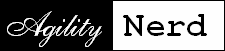
My intent with this icon was to show the motion and fluidity of dog agility by the flourishes of the script font used for “Agility” and combine it with the analytical aspects of my commentary depicted by the “computer-ish” Courier font used for Nerd. The two different background colors were highlighting the contrast between the concepts.
I’ve never been entirely satisfied with the choice of those fonts. Now that there are more fonts available in the public domain I’ve come up with some more ideas. The first couple depart from two fonts to go to a single font approach:
I like the Home Remedy font used in the first two ideas and in “Nerd” in the others. It shows the “construction” of the letters, paralleling my interest in how agility handling and training is learned and executed. The fine layout lines are reminiscent of the grid on an agility course diagram.
The remaining three proposals “riff” on the idea of using script fonts to display the motion and agility of the sport combined with analytical/construction of the Home Remedy font.
I was also looking to create a simpler icon that had a closer to square shape. Square shapes work nicely in the little Favorites icons you see on your browser tabs and other web places. Here are a few color options playing with the Home Remedy font:
I’d like to hear what you think!
If you enjoyed this article won't you please:  Thanks!